Website Design for the Dutch Speciality Products Store
Feb - May 2022
Project Overview
Redesign the website interface and user interaction process to make the website more beautiful and user-friendly
Target audience
Dutch people living in the United States or those who have a great interest in Dutch culture, aged 25 years or older.
Problem statement
The website of The Vander Veen’s Dutch Store lacks many design principles and is not user friendly.
The page is hard to read, contains too much information, uses too small typography, it’s hard to navigate through the page, used colors are not pleasant (especially red coloring) and the overall experience is confusing and messy. Another finding is that the page doesn’t create an emotional connection with the user.

My Contribution
Researcher, UX/UI Designer
Tools
Adobe XD, Adobe Photoshop, Adobe illustrator

The Client and Needs
Our client is The Vander Veen's Dutch Store. The store has been a premier source of Dutch products in the U.S. for over 80 years. As a direct importer from Holland, the store offers hundreds of varieties of Dutch food, wooden shoe slippers, souvenirs, and household items. All of the products can be shipped directly to the customers' homes.
And they want the website seem user-friendly and more welcomed vibes. Besides, all products and contents have to be organized and well structured.
New Website Concept
The new website color scheme uses orange, the representative color of the Netherlands, as the main color, complemented by green and slightly yellowish colors. I wanted to use this color scheme to improve the reliable and user-friendliness of the website.
Major change to the layout of the site is that the list of site products on the index page was moved to a drop-down catalog at the top of the page, allowing more space on the home page to showcase shopping activities, etc.

.png)

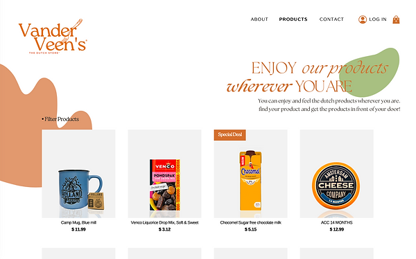
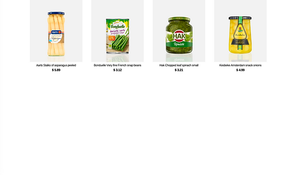
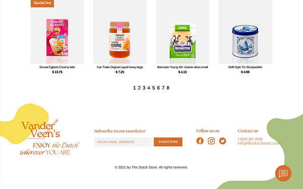
The Product Page

